Thursday, March 23, 2017

BFF Open House Link Party


Happy Friday Eve everyone! Hope you've been having a wonderful week. Let's take a look at some fun ideas shared at last week's party. 


With Easter coming in a few weeks, bunnies are popping up everywhere. Love this 3D Bunny Head shared by Lolly Jane


I think the Bunny Head and these Fabric Eggs from Penny's Vintage  go perfectly together don't you ?


How about a Bunny Banner ( say that three times fast!) . Jenny Louise Marie has a cute one ( and a cute chalkboard too!). 


This  week's chocolate feature is a Bailey's Chocolate Coffee Cream Pie from Marilyn's Treats. YUM!

Now on to this week's party! 


Wednesday, March 22, 2017

Lettering Journey and PicMonkey Trick


Oh hi! Is it Wednesday? It's been one of those kind of weeks where I've lost track of the days. 

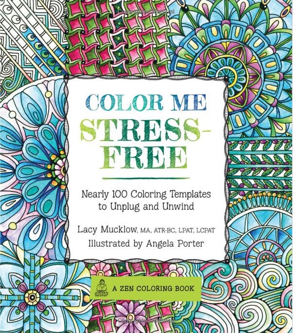
One of the reasons I took up Lettering as a hobby is because I have "those kinds of weeks" a lot ( my day job). While for many people Adult Coloring is therapeutic. It's not for me, but Lettering is. 

Image result for adult coloring not therapeutic
NOT TRUE FOR ME! Anyone Else? 

As I practice more, and (hopefully) get better, I want to do things with my lettering. I now know I prefer scanning my pieces in vs photographing them and importing them that way. I find I get better clarity, fewer shadows, better color etc. 

I scanned in the piece I used in this post ( a quote from Shakespeare's "A Midsummer Night's Dream")  and cropped it in PicMonkey. You remember I showed you last week how you can use overlays to use PNG files. No worries I linked that for you so you don't have to look for it! 

Today I'm going to show you something I figured out quite by accident. After I scanned in my image I was looking around in PM  and decided to play with textures. I figured out that I can use PNG or JPG images to change the background behind my image. This may be a big "Duh" to some of you but it was a total "Ahhh-ha" to me.  

Why? 
At least for now, I don't need to shell out for PhotoShop.  But Carol, why would you have to shell out for PhotoShop? Because it lets you do really cool stuff like make layers so you can make white backgrounds transparent so you can do more cool stuff like put your lettered stuff onto other backgrounds! In other words, I could hopefully maybe fingers crossed use my Lettering pieces as their own overlays on pretty background images that I download constantly and then use them to make pretty things! 

This little trick I figured out works similarly and it doesn't take much to make me sooooo happy! 

Here's the image I started with : 
I'm also discovering I like mixed type lettering the best


Steps: 
  • Scan or download image ( I don't know how this works w/ color images so let me know if you try) into PicMonkey. 
  • Crop / Size 
  • Click on the Textures Menu (7th option down on the left, looks like a screen)


  • Click on "Your Own" and then "Your Own" again ( don't ask me why they do this twice) 


  • Choose the image you want as your background and then click on Apply. 
  • This is the image I used for the background: 

From Creative Market Watercolor Pastel Flowers
And done!


Saturday, March 18, 2017

Sketchy Floral Cards

I feel like I always make cards in pairs. It's not intentional, just works out that way. This time for a couple of family birthdays this month. Funnily enough I got the color inspiration from a piece of paper I ended up not using. 


The floral paper in the upper left is what I thought I was going to use and then ended up not. As I was staring more at the light blue paper with the black and white florals, I remembered some clear stickers in my stash and decided to make them the focal of  my cards. 


Supplies and Steps: 
  • White Stardream Cardstock 
  • Assorted Scrapbook papers
  • Clear Stickers
  • Spellbinders Nestabilities  Label Dies
  • Cuttlebug
  • Embellishments

Basic Steps: 
  • Cut white cardstock for 5x7 card, score
  • Cut scrapbook paper panel 4.75 x 6.75 and a coordinating piece 4x6, layer as shown
  • Cut 2 sets labels using Label Dies ; cut in half ; layer on top and bottom of 4x6 panel as shown
  • Layer clear stickers on white cardstock and trim. Mount to front of card using foam dots.
  • Embellish with self adhesive rhinestones, sequins, and Stickles 

I liked how the simplicity of the clear stickers went with the sketched look of the floral paper. 

For this one the stickers were one big cluster but I cut them apart and then re-grouped three of them together as the focal. One went directly on the paper and the other two I elevated with foam dots to give some dimension. Now I need to do something with the "inspiration" paper!


Spring Tags Giveaway Winners!


Congrats to Megan and Barbara who are the winners of my Spring Tag giveaway! Winners were randomly selected via Rafflecopter. Each has been emailed. 

Thanks to all who participated. I hope  you enjoyed it as much as I had fun making these.


Thursday, March 16, 2017

BFF Open House Link Party


Happy best day of the week Friday Eve!!! Hope everyone had a good week despite the crazy weather everywhere. The PNW gets a bad rap on rain but I heard last night on the radio that we've had as much rain since October 1 as we usually get in an entire year! Ready for some dry days here. 

Let's see some ideas shared at last week's party: 


Love this wooden backdrop from My Busy Beehives! She keeps it on her mantel and changes out what's on it seasonally. I am also in love with the Spring wreath she has on it! 


There must have been something in the air last week because here's another wreath I am in love with. This one from Maggie Lois. The mix of textures and colors of greenery really come together for a simple but impactful wreath. 


Now I didn't plan on having wreath centered features but it just turned out that way! I also love this Spring Tulip Wreath from Alaynas Creations. Once again common materials and colors make an impact! 

Since tomorrow's St. Patrick's Day, this week's chocolate feature is perfect ( not that you couldn't make these whenever!). 


Guiness Stout Chocolate Cupcakes with Irish Cream Frosting! YUM! Thank you for sharing Bird's Party


Now let's see what you've been up to this week!


Monday, March 13, 2017

Spring Is In The Air Printable and (Mini) PicMonkey Tutorial


Well it is somewhere right? Not in the Northeast which I understand is expecting quite the snow storm. And here in the PNW it's been rainy and cold. 

The calendar tells me there's a week until the beginning of Spring so I played around with "Dream Bouquet", a collection of watercolor flowers from designbundles.net. It's their freebie of the week (only free  for three more days!!)  and maybe some wishful thinking will speed Spring along? I also made a version with pink text. 


I created them in PicMonkey using a transparent background and then adding the images using the Add Overlay function. PicMonkey's not new so this may be old news but it's one of my go to tools.

Basic steps: 

1.) Go to PicMonkey. 

NOTE: It's free unless you want to upgrade to a Royale Membership which grants you access to additional features and fonts.  I had one, let it lapse and so far I'm good since you can add your own overlays and use most of your own fonts which was my main reason for getting it.  

2.) Select "Try Templates" 

3.) This will bring up pre-populated templates you can play with ( they'll indicate whether they're free or not) but you can also search / select what you want. I usually do printable 8.5x11 so I selected that from the Print Size pull down


4.) Once you've chosen your size, you want to make your background transparent which takes the click of a button: 


Under the "Basic Edits" option ( first one on the left) click on Canvas Color and then click on Transparent Canvas.  Your background will show as a grey and white checked pattern but this will not show once you print or use online. I prefer the .PNG format so that if I want to print on a colored or patterned paper it doesn't obstruct it. Of course if you want your background to be a color you choose that color from the slide bar that's shown. 


4.) Add your images using the Overlay tool. This is the butterfly, 4th option down the left side. There are many many free overlays within PicMonkey so you can mix and match between theirs and your own ; use just your own ; use just theirs. To use your own click on the Add Your Own button at the top and then you can use your library of either png or jpg images. 

From here it's a matter of adding, sizing, and layering your images and adding text. Using your own fonts is similar to using the Overlay tool but instead you click on the Tt on the left, choose Your Own on the fonts menu and go from there. 


C'mon  Spring! We KNOW you're out there! 


Thursday, March 9, 2017

BFF Open House Link Party


Happy Friday Eve all! Hope everyone's had a great week. Some fun ideas shared at last week's party so let's take a look at a few of them shall we? And oh ...a reminder that I have a little Spring themed giveaway going on through next week here.


Alayna's Creations shared an awesome  Spring Care package idea.I've been doing care packages for PhD Boy since he was College Boy but I love that she did a whole season!  Hers is for her deployed husband and covers all of the Spring holidays. There are smaller care packages within the big box! 


I'm seeing foxes everywhere lately. Creative genius extraordinaire MichLinLA came up with a fox themed necklace using something you would never guess. Really... you won't! 


My never ending bucket list includes wanting to be able to make gorgeous cakes. In the meantime, I live vicariously through those who can like Paisley and Pugs who shared this incredible unicorn cake. How cute is this? 

And for this week's chocolate feature? What's better than a chocolate chip cookie? How about one stuffed with a peanut butter cup?! You're welcome. From Sugar Spice and Family Life


OK let's see what everyone's been up to this week!