Showing posts with label Tim Holtz. Show all posts

Wednesday, August 8, 2012

Core Cards Creative Frenzy DT Call

Core'dinated Damask Cards

I love it when an unplanned plan comes together. Core’dinations is having a design team call and it so happens they asked for three cards. It also so happens I needed to make three cards and so VOILA.

If you’ve seen any of my card posts, you know I already love their stuff and use their papers a lot so naturally already had some in my stash. I also have a thing for neutrals so I coordinated my Core’dinations cards using a neutral palette.

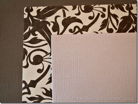
I chose a Core Essentials paper in Weathered Tin and a Gemstone paper in Pearl. Also used a floral print paper from my stash:

Core'dinations Papers

You can see the textures in the two solid papers which are fun on their own, but I love running this through an embossing folder to really bring out the texture.

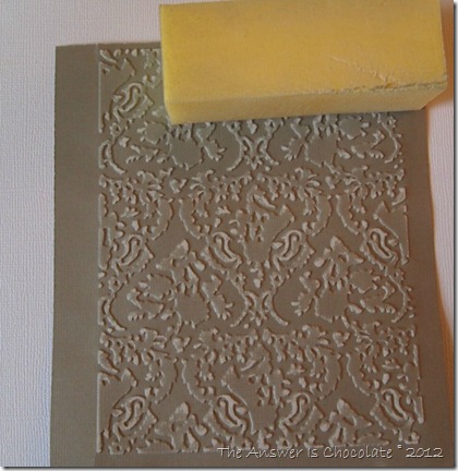
Embossed Panel

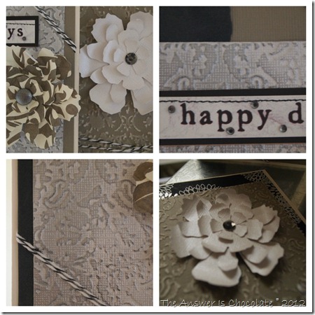
I used a Tim Holtz embossing folder (Damask) and ran through my Cuttlebug. TIP: Cut your panel slightly larger than your embossing folder and then trim to size after you emboss. The Core’essentials paper is great for sanding or tearing. I used a sponge-sander-thingy leftover from a pedicure. TMI?

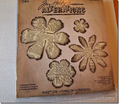
Tim Holtz Die

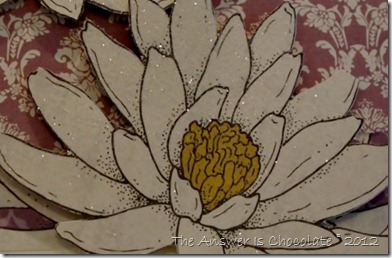
Speaking of Tim Holtz, I also used one of his dies to cut out some layered flowers for my cards. Some of these I cut from the damask paper. Others I used pieces of my Core’dinations papers.

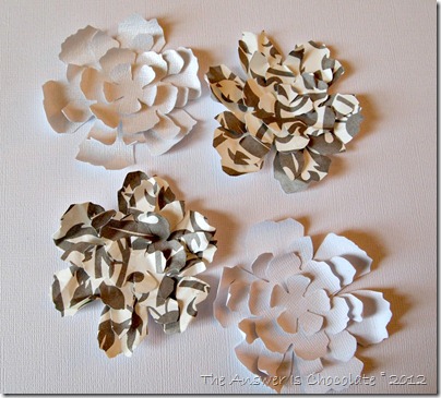
Layered Flowers

For the patterned paper flowers, I scrunched them up before I layered / glued them together. For the Core’dinations flowers I used the end of a small paintbrush to curl the edges. I just couldn’t leave them flat ya know?

Damask Card Black

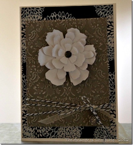
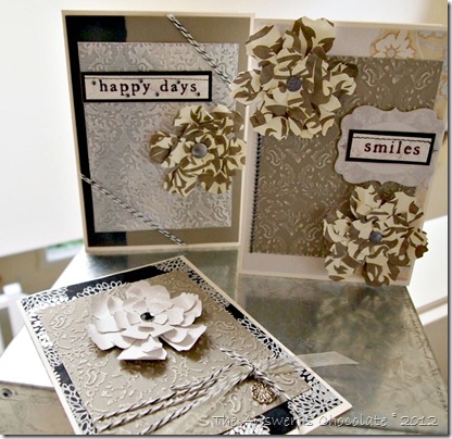
This card uses a handmade Japanese paper for the main layer; the embossed Core’dinations panel; “molded” Core’dinations flower with a rhinestone center. I tied black and white baker’s twine around the panel and finished off with a floral charm.

Damask Card Smiles

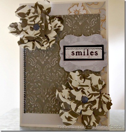
For this card, the first layer is Core’dinations Gemstone Pearl; embossed Weathered Tin panel, handmade Japanese paper strip and “scrunched” dlowers. Trimmed with rhinestone strip, a chipboard die cut, and “smiles” sticker.

Damask Cards Happy Days

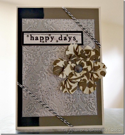
For the last card, I used a Weathered Tin panel as the first layer; embossed Gemstone layer rubbed with Rub N Buff and Ranger Distress ink; a suede paper strip; scrunched floral flower and baker’s twine.

Damask Cards Collage

Wish me luck!

Tuesday, June 12, 2012

Tim Holtz Gears Father's Day Cards

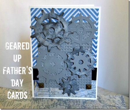
Geared Up Father's Day Card

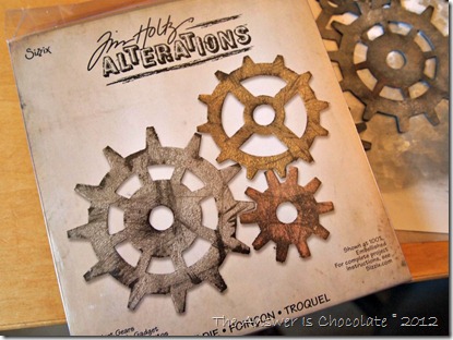
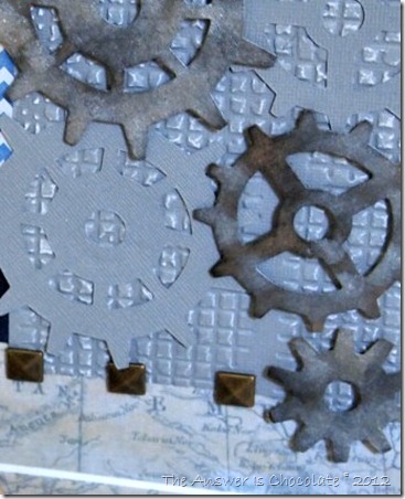
I always find “Man Crafting” a challenge. Thankfully there’s Tim Holtz. I love his grungy rugged Alterations dies and folders. When I saw the gear die, I knew it would be perfect for Father’s Day cards.

Tim Holtz Alterations Gears

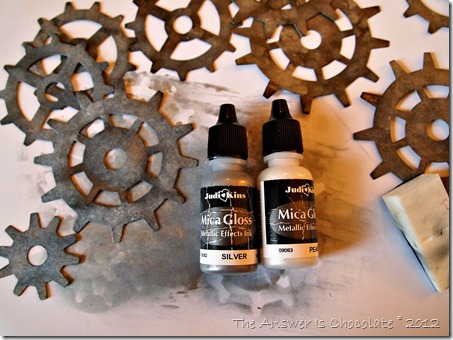
I bought this huge bucket o JudiKins Mica Gloss a couple of years ago at a stamp show and thought I could use it to achieve Tim’s signature distressed look.

Cut the dies from kraft cardstock and then went over them with Tim’s Distress Ink for Ranger in Black Soot. Sponged over that with Mica Gloss silver and pearl:

Mica Gloss Painted Gears

The cards are 5x7 and I used papers from  DCWV’s Tradewinds stack and C’oredinations .

I love the Tradewinds stack and it’s got lots of “guy goodness” with keys, maps etc.

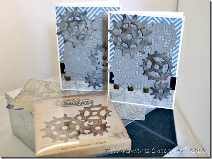
Tim Holtz Gear Father's Day Cards

I left some of the gears plain and then ran a panel of the C’oredinations paper through a Sizzix Embossing folder and then roughed it up some more with a pedicure block. Yup. A Pedicure Block. Love the cosmetics section at Dollar Tree! Used sponges from there to apply my inks.

Finished with some metal adhesive thingies I’d picked up on a Michaels run.

Geared Up Cards

Yes. metal adhesive thingy is a technical artistic term !

Don't forget, I have a giveaway of Mod Podge goodies going on through Friday. Enter to win here

Sharing At: 


Monday, May 7, 2012

Recollections "Fashionably Chic Mother's Day Cards

Glitter Damask Mother's Day PM

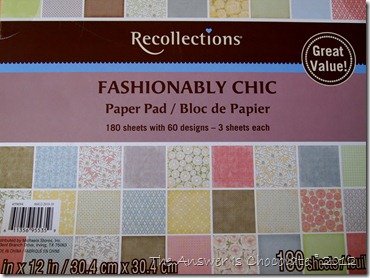
I’ve confessed my paper addiction before. It’s not getting any better. I wasn’t even looking for paper when I walked past the paper stack section at Michaels and Recollections “Fashionably Chic” jumped off the shelf at me. Practically attacked me. It did!

P5064883

The cover doesn’t do it justice. It repeats the same series of patterns in several colors and within a color family, you can mix the patterns.

Glitter Damask Mother's Day
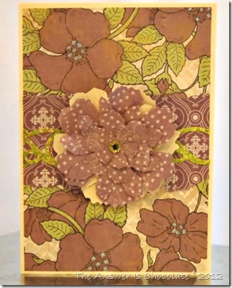
I  made several different cards because I always like to recognize the special women in my life on Mother’s Day.

For the first card, I glued the scrapbook paper to a piece of cardstock to give some body, and then cut out the flower, hit it with a spray of adhesive and glittered it.

I used another piece of the same floral paper and a piece with a coordinating damask print for base panel of the card . Used foam dots to adhere the glittered flowers to the card.

Mother's Day Floral Recollections

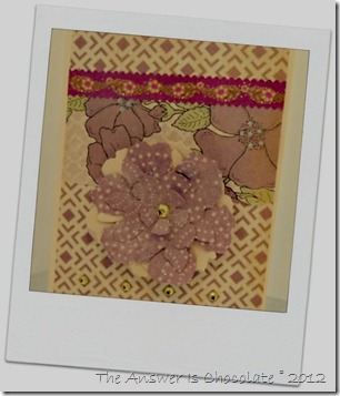
For this one, I used a different floral pattern and dotted the inside of the flowers with iridescent Stickles. For the focal flower, I used Tim Holtz Alterations Tattered Floral die and cut the flowers using my Cuttlebug.

Recollections Fashionably Chic


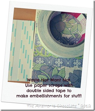
SOOKWANG Tape

I don’t like to waste pretty paper so I use scraps to make embellishments to use in cards and other projects. This double sided tape I got at my local stamp store and is by a company called Sookwang. You can also use this tape to make your own washi tape.

I also played with another color combination from the stack:

Neutral and Yellow Mother's Day

I'm telling you. Paper just jumped off the shelf at me. Really.

Sharing At: 


Tuesday, January 24, 2012

More Valentine's in Gray and White

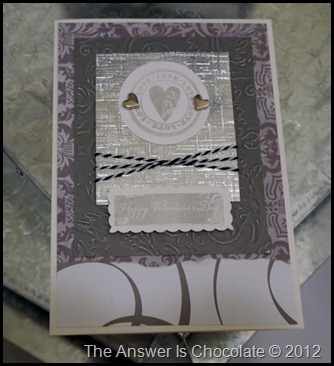
I had so much fun playing with a gray and white color palette that I made some more Valentine’s Day cards using it. This time I used G Studio’s clear stamps…the kind you find at Michaels for $1, and ink by “Fresh Ink” in Provincial Gray.

Silver Gray White Valentine

I love this ink because it’s a pigment ink with a chalk like finish, but it’s kinda hard to see in a picture.

Valentine Gray White

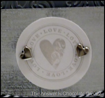
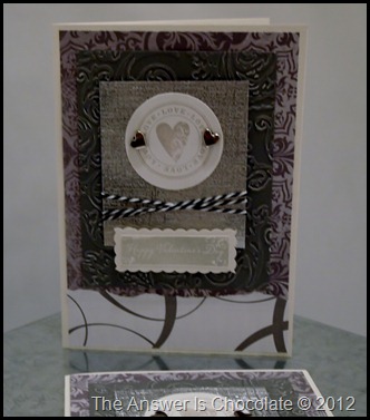
I stamped the image on white cardstock and punched with a circle punch and used two heart shaped brads to attach to a panel of silver cardstock.

White Gray Silver Valentine

I ran the same Core’dinations gray paper I used in my other cards through my Cuttlebug using a Tim Holtz texture folder, and layered that onto a gray damask panel. Accented w/ black and white baker’s twine.
Happy Valentine's

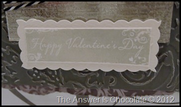
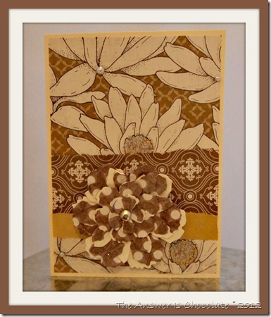
Stamped the sentiment in white cardstock, trimmed then layered onto another piece of white, trimmed with decorative edge scissors.

Sharing At:
Photobucket

Thursday, January 19, 2012

Valentine's In Gray and White

For the past couple of years I’ve enjoyed making non-traditional color Valentine’s cards. I went through this phase with Christmas décor so I guess my muse just moved ahead on the calendar!

This year I am playing with a palette of gray and white with accents of black and silver. Maybe it has something to do with being covered in snow and ice right now!

White and Grey Valentine

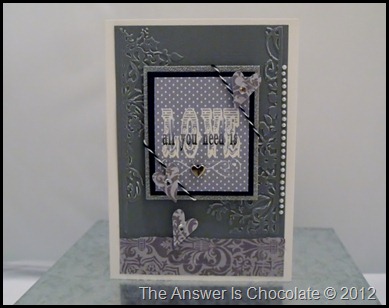
I used white cardstock for the card and Core’dinations textured paper (Stormy Gray), dry embossed using Tim Holtz “Floral and Fancy Frames” texture fade embossing folders.  The patterned strip on the bottom is Deja Views Sweet Romance Gray Damask.

Grey and White Valentine

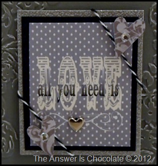
The “LOVE” focal was computer generated using My Memories Suite digital scrapbooking software, sized (2.5 x 3 ) and then mounted on black and glittered silver cardstock. Finished with hearts punched from more of the damask paper, black and white baker’s twine, a silver heart brad, adhesive rhinestones and pearls.

Grey White Valentine

Sharing At:


Saturday, September 10, 2011

Grandparent’s Day and Birthday Cards

While tomorrow is the 10th anniversary of September 11, a day  none of us can ever forget, it’s also Grandparent’s Day. The anniversary makes it even more important than ever to remember special people in our lives.

My son has my mom and my husband’s dad left as grandparents. I think he appreciates them even more now that he’s older, and they have been there every step of the way for him. I’m sure they won’t mind that this year we signed their cards on his behalf since he’s away at school and it seemed silly for me to make them , mail to him and have him mail to them!
Grandparent's Day
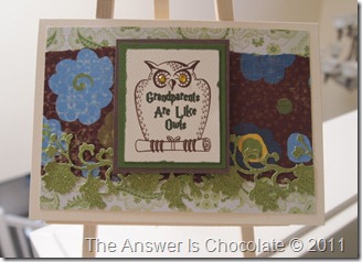
Owls immediately came to mind because they’re a symbol of wisdom…jut like grandparents.
Grandparent's Day Card Closeup
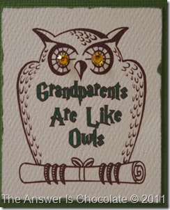
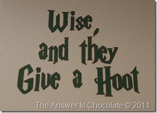
I used a graphic from my PrintShop program and generated the text using a Harry Potter font since the image reminded me of Hedwig. Used some coordinating papers and embellishments from my stash.  Added amber colored rhinestones for the eyes. The inside of the cards read:
Grandparent's Day Card Inside
Cheesy maybe, but true!

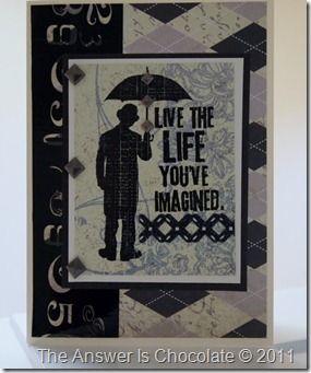
I also had a birthday card to make and guy cards are always challenging but Tim Holtz helped me out along with Making Memories Paper Reverie line with this cool argyle print:
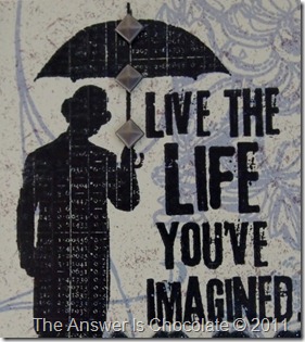
Tim Holtz Life Imagined

Tim Holtz Life Imagined (2)
I stamped the image on a scrap of patterned paper and mounted it to a cream and then black scrap. Ran some patterned packing tape down the panel of the Making Memories paper and finished off with some metal self adhesive embellishments.

Saturday, April 2, 2011

I’ve Been Challenged to A Duel!

Mich in LA slapped my face! Sure she looks all innocent in that pic!

OK she didn’t actually, physically, smack my face…she’s way too cool for that. But she did challenge me! YIKES. Have you seen her creativity and her series on “Guess The Mystery Thing”? I hid under my bed.

When I emerged wearing my big girl pants, I agreed. I can take the public humiliation! That’s why there’s chocolate right?! This was actually the brainchild of another fun blogger, Michele from Michele Made Me ( there’s a theme!) . It’s called “Make It Good”

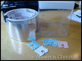
a two person, recycling craft challenge. The challenge rules can be found here but basically, you are issued a theme and a required element and the rest is up to you! Our theme was Industrial Architecture and the required element was…………bread tags! You know, those plastic square tags that keep your bread bags closed?
After almost giving in to chickening out, I started looking around at images of Industrial Architecture and kept coming back to old abandoned factories. So I found an image in my PrintShop Deluxe program that I thought I’d use. I also looked around my craft room and my eyes landed on an empty container in my stash along with some aluminum tape from the electrical aisle at the HW store.
IMG_5171
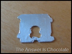
I covered my bread tags in the aluminum tape because in my head they became “bricks” to go on my “building”.
IMG_5174

IMG_5180
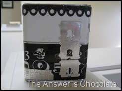
For the box itself, I covered it first w/ white contact paper and I roughed it up a bit with an emery board to make it more Industrial. I went around the bottom half with some decorative tape I’ve used on other projects.

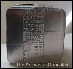
I applied some of the aluminum tape to a scrap piece of cardboard ( cereal box) and ran that through my Cuttlebug using Tim Holtz’ Texture Fades ( Dot Matrix and Gridlock) embossing folder. Tore pieces of that up and applied to the box.
IMG_5182
This is the top of the box with a closeup of the grunged aluminum strip. Covered the top of the box with the aluminum tape. I went around the top edge of the box w/ a K&Co adhesive scrapbook border.
IMG_5178
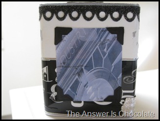
I took the image from my PrintShop program and made it a negative and aged it. Printed it out, covered it with clear packing tape, added photo corners, and adhered to the container.

So there’s my Industrial Architecture Bread Tag Using challenge submission! And now for the scariest part.....I link here to Michelle's project and invite you to go visit.  We’ll now await her, and your judgment!